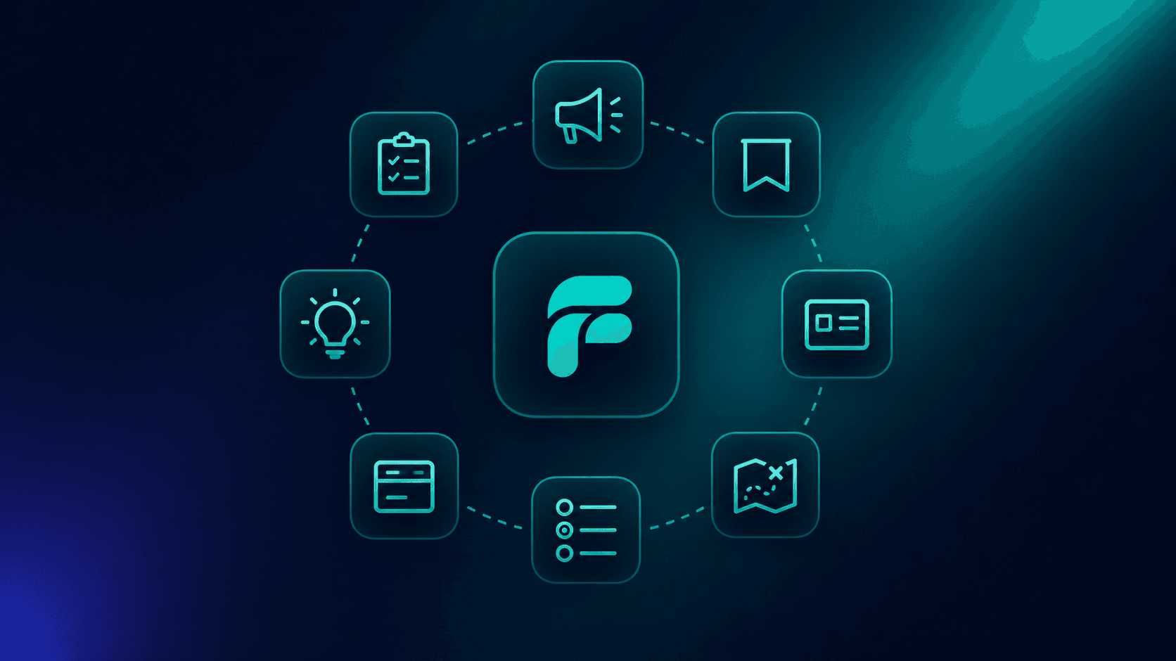
Most onboarding flows are built from the same eight or so components, recombined in different ways. If you know the components, you can read any onboarding flow on the internet and tell pretty quickly what is going on, what is going to work, and what is going to flop.
This is a reference. One section per component, with what it is for, when to use it, and links to real examples in production at named companies.
A modal or full-screen overlay that announces something new. The big one, in the middle of the screen, that you have to dismiss to continue.
Use it when: You ship a major new feature, do a redesign, or have something the user genuinely needs to see before continuing.
Avoid it when: The user is mid-task, the change is incremental, or the announcement is more for the marketing team than the user.
Good examples in the wild:
Anti-pattern: Announcing every minor change with a modal. You train users to dismiss instinctively, and the one announcement that matters gets dismissed too.
See more on the Announcement component page.
A horizontal strip across the top or bottom of a page. Less intrusive than a modal, persistent until dismissed.
Use it when: You have a piece of information that is timely and lower-priority than a modal. Maintenance windows, feature trial expiry, billing reminders.
Avoid it when: You stack three of them. Banners do not compose well. One banner is signal. Three is noise.
Good examples in the wild:
See more on the Banner component page.
An inline card that sits in the product flow, often promoting a feature or guiding next action. Persistent and dismissible, but not blocking.
Use it when: You want to surface a recommendation or feature without getting in the way. Often used inside dashboards, project sidebars, or empty states.
Avoid it when: You have nothing useful to put in the card. An empty-feeling card is worse than no card.
Good examples in the wild:
See more on the Card component page.
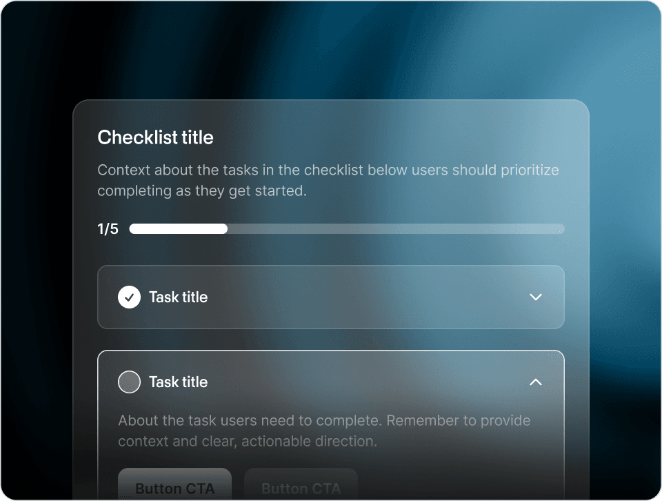
A list of steps the user needs to complete to be set up. The single highest-leverage onboarding component for most SaaS products.
Use it when: Activation requires multiple steps and the user benefits from visible progress.
Avoid it when: There is genuinely only one step, or you are using it to pad a thin onboarding into something that looks substantive.
Good examples in the wild:
- Loom's onboarding checklist
- Cal.com's product checklist and feature promos
- Warp's onboarding checklist
We wrote a whole article on what makes a checklist work in How to Build Effective Product Checklists. The short version: keep it under five steps, mark steps complete based on real product events, and let the user dismiss it.
See more on the Checklist component page.
An in-product form for capturing user input. Onboarding forms (intent capture, profile setup), feature configuration forms, feedback forms.
Use it when: You need data you cannot infer, and the data will change something the user sees soon.
Avoid it when: The form is for the CRM, not for the user. Long demographic forms during onboarding are the most common version of this anti-pattern.
Good examples in the wild:
See more on the Form component page.
A small contextual callout pointing at a specific UI element. Less heavyweight than a tour. Often opt-in.
Use it when: You want to draw attention to a specific feature without forcing the user through a sequence.
Avoid it when: You sprinkle hints everywhere. Hints are valuable because they are rare. If every button has a hint, none of them do.
Good examples in the wild:
See more on the Hint component page.
A short in-product survey for collecting feedback. NPS, CSAT, single-question prompts.
Use it when: You need direct user signal that analytics cannot give you, the timing is appropriate, and the question is specific enough to be actionable.
Avoid it when: You are running it because it is on the OKR for the quarter and not because you have a real decision to make from the answers.
Good examples in the wild:
We covered the deeper playbook in The In-App Survey Playbook.
See more on the Survey component page.
A sequence of overlays guiding the user through a flow. Most commonly seen, most commonly skipped.
Use it when: You are introducing a redesign or new section to existing users who already know the product.
Avoid it when: The user is brand new and the goal is activation. We wrote about why this fails in Why Most Product Tours Get Skipped.
Good examples in the wild:
See more on the Tour component page.
Most strong onboarding flows use a small subset of these components in coordination, not all of them at once. A pattern that consistently works:
- Form at signup to capture the one or two fields that personalize the rest of the experience.
- Checklist as the activation backbone, with three or four real action items.
- Card or Hint as the contextual prompt for follow-on actions once the checklist is dismissed.
- Banner for time-sensitive announcements.
- Survey at a thoughtful moment, asking one specific question.
- Announcement reserved for the genuinely big things.
- Tour only when introducing changes to users who already know the product.
If you have all eight of these firing on every new user, you have an onboarding flow that will frustrate everyone. If you have one of each used carefully, you probably have something good.
The components themselves are not the work. Picking which ones, when, with what content, is the work. Browse the examples library to see how named companies make those choices.
There is a 9th pattern emerging that does not fit the rest of the list because it does not require authoring anything: an autonomous in-app agent. The Frigade Assistant is the version we are building. Instead of authoring tours and checklists, you connect the assistant to your product and it learns the product by using it the way a real user would. From there it works in two modes: on demand when a user asks "how do I do X," and proactively via Frigade Suggestions, AI-driven tours and contextual nudges surfaced on their own at the right moment for each user. It guides users through workflows, fills forms, navigates to the right pages, and detects friction before users file support tickets.
If you are evaluating the eight patterns above, it is worth knowing the 9th one exists and is starting to eat the parts of onboarding that flow-builders never solved well.