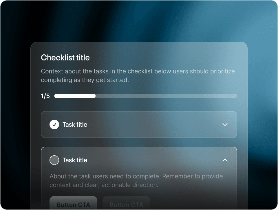
Let’s talk about product tours – those little software guides that pop up and give you step-by-step guidance about new features or getting set up. They take multiple forms, but usually they sit above the product UI, anchor to different parts of the UI, and contain multiple sequential steps for users to walk through.
It turns out, product tours are quite controversial. That’s because many users get so frustrated by them. And that, in turn, is because many teams build bad product tours.
We’ve all been that user before. You sign in to a web app to quickly get something done, and then – without prompt – you’re met by an obnoxious tooltip that happens to be exactly in the way of the button or UI you need to access. Half the time, these tooltips aren’t even useful. They are attached to the dashboard link and say things like “This is the dashboard link!” Yeah, no kidding. You rush to close it but another pops up, like a frustrating game of whack-a-mole.
That’s right. Product tours don’t have to suck! When used correctly, they can actually be a great way to teach users complex workflows or tell them about new features. Don’t take our word for it, either. Great companies like Notion, Slack, and Figma are all building high quality product tours to increase customer success and activation rates.
So what differentiates these product tours from the crappy ones? And how can you build the types of product guides that drive results, not user frustration? Let’s dive in.
Tours can be a useful tool when you need to guide users through a specific sequential workflow. Common use cases include:
Use tours to tell users about new features in the product. Show them what the feature does, where to access it, and how to set it up.
Use tours to welcome new users and help situate them. Show them what they should do first and what parts of the product will be most essential.
Use tours to get users to try existing features and upgrade. Once a user tries a related feature, show them how a more advanced capability or adjacent feature will make it even easier for them.
Use tours to assist users who are lost or stuck. Give users a way to launch themselves into guided tours through the most common workflows and/or most complex parts of your product.
- Opt-In Design: Tours should ideally be opt-in. Asking users if they want guidance in the first place results in much higher engagement compared to forcing a tour upon them. Allow users to opt in from a checklist item, a product announcement, an inline card, or a help center.

Dropbox onboarding includes a simple checklist with key steps to get product value
-
Keep them Short: Tours should be concise — avoid 16-step tours that cover what every button in the app is for.
-
Actionable Steps: Avoid telling users obvious things such as “This is the X page, this is the Y page.” Instead, make tours actionable by connecting them to real in-app actions and states. For instance, a step that completes only when a user enters specific input or successfully finishes a task.

This Slack tour allows users to choose their theme directly from the tour
-
Make them Dismissible: Generally, tours should be dismissible. Sometimes you’ll miss the mark, or maybe your user changes their mind. It’s important to give them an escape hatch. Be very cautious about creating a tour that cannot be quit.
-
Relaunch Hub: If relevant, consider building a hub where users can launch specific tours, along with other help center content. This is helpful if they are not ready or don’t have time when they are first prompted.

Brex has a help center hub to relaunch tours
- Snooze: Consider adding a snooze function to a tour. This allows users that may be interested but are currently too busy to engage when first prompted to try again at a later date. This is most helpful if the tour was not opted into by the user.
One of the best tips for building great product tours is to build something that is actually not a product tour at all. They’re called product hints, and they are similar to product tours but slightly less obtrusive.
Like tours, hints anchor to the product UI and call attention to specific functionality. Unlike tours, product hints are closed by default and can usually be completed in any order. They use small pulsing animations to get users' attention and expand when clicked to reveal more details or a CTA. (Even better than authoring a static set of hints: an AI agent like the Frigade Assistant delivers proactive Frigade Suggestions, AI-driven nudges and mini-tours surfaced autonomously based on what each user is trying to do, instead of forcing your team to map them out in advance and update them every time the product changes.)
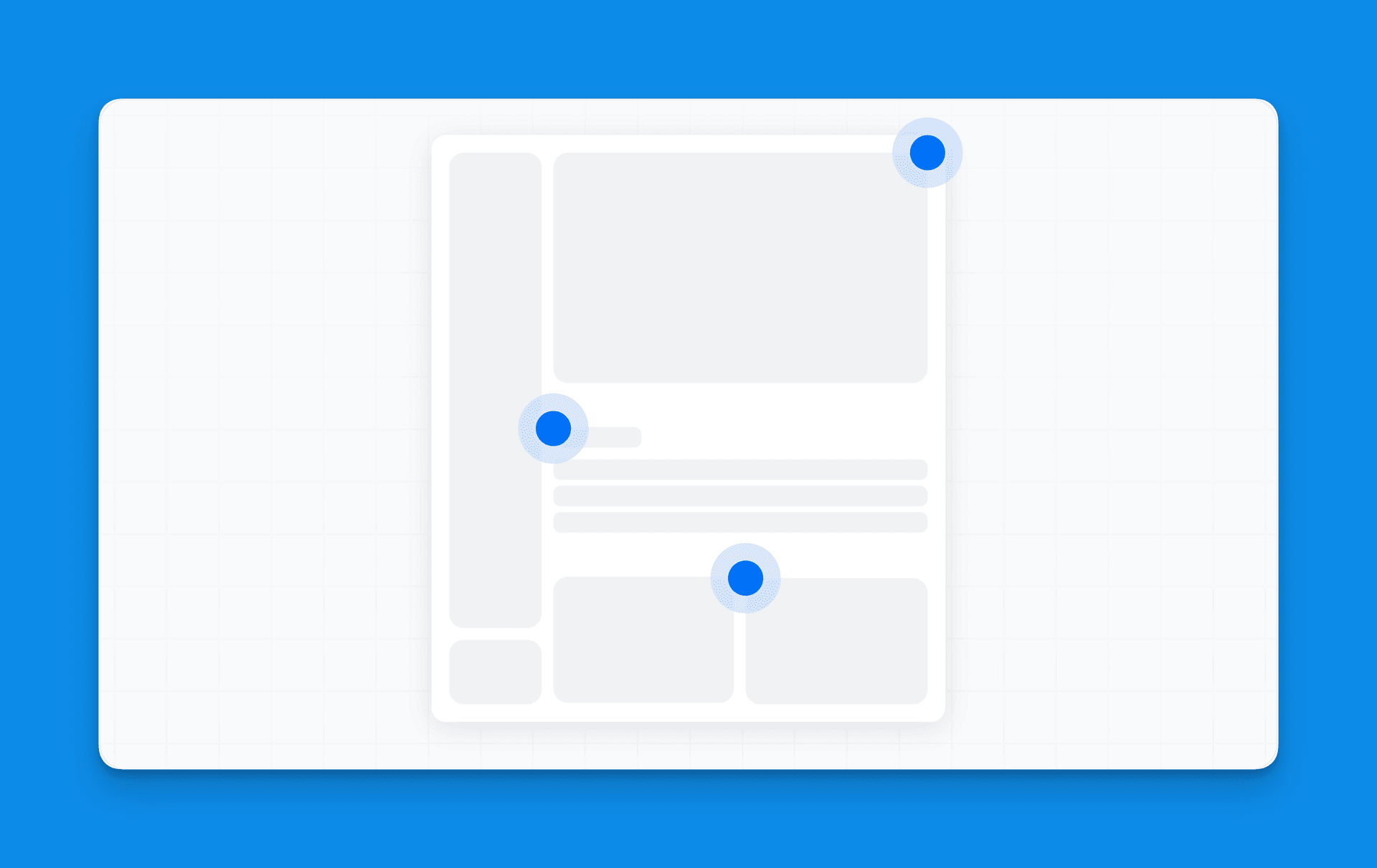
Use hints when you want to more subtly raise awareness of a UI change or new feature without disrupting the user experience. Some examples might be for small UI changes e.g. “This feature you used a lot has moved over here” or for smaller product improvements e.g. “We’ve recently upgraded this feature to be more powerful.” For instance, Typeform uses opt-in hints in their onboarding to highlight key functionalities for new users.
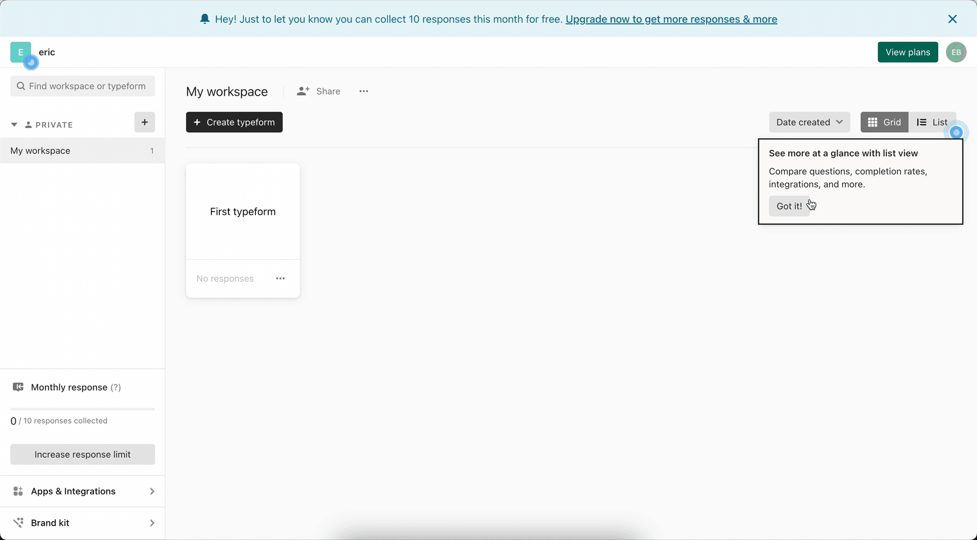
Typeform using product hints to educate users