Open any SaaS product, sign up with a fresh email, and count how long the first product tour modal stays on screen before you instinctively close it.
For most people, the answer is somewhere between two and five seconds. Industry data backs this up: dismissal rates on the first step of a modal tour routinely sit between 60 and 80 percent. By step three, you are talking about single digits of survivors.
This is not a UX problem you can fix by writing better tour copy.
The user just gave you their email. They are looking for the answer to a single question: did this product give me what I came for?
The product tour is in the way of that answer. The tour is your onboarding team's mental model of the product, presented as obstacle. The user does not want a map. They want to do the thing.
So they close the tour. Then they look at the actual UI, scan for whatever button looks like it does the thing they came for, and click it. If they cannot find it in about thirty seconds, they leave.
This is not laziness. It is the rational behavior of someone who has been trained by a thousand products that the tour will not actually help them.
Three reasons, in roughly the order they tend to come up in planning meetings:
- It feels comprehensive. A tour covers everything. Shipping one feels like onboarding has been "addressed."
- The vendor demo looked good. Onboarding tools demo their tour authoring UI, because the WYSIWYG is the part that sells. The tour is the path of least resistance for proving you used the tool.
- No one is measuring whether it works. Tour completion rate is a vanity metric. If you only measure that, every tour looks like a success.
There is a real difference between a product tour and an interactive walkthrough, and we wrote a whole guide on building tours that do not suck. The short version: a tour describes, a walkthrough requires the user to act. Activation requires the user to act, which is why the walkthrough shape is the one that moves the metric.
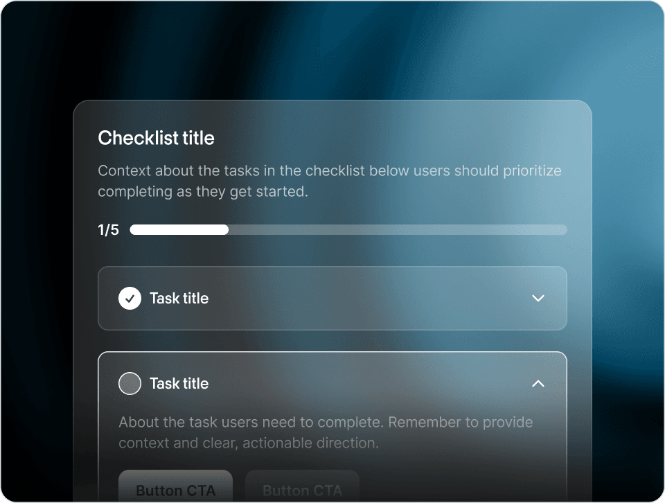
The pattern that consistently survives the "skip rate" filter is what you would call an embedded checklist with opt-in steps. Here is the shape:
- The checklist sits in the product, usually as a card or sidebar widget. Not on top, blocking the UI.
- The first item is something the user can complete in under thirty seconds, often something they would do anyway.
- Each subsequent item is a real action, not a "view the dashboard" type filler.
- Steps complete based on actual product events, not based on the user clicking a "mark complete" button.
- The user can dismiss the whole thing without consequence.
Cal.com is one of the best examples in the wild. The checklist sits inline in their product, the steps are concrete, and each step links directly to the action you would take to complete it.
Loom uses the same shape. So does Mercury.
The reason this pattern works where the modal tour does not is that the user retains agency. They can ignore the checklist, do their own thing, and come back to it later. They are not trapped behind a slideshow.
If you currently have a modal product tour in your product, the simplest A/B test you can run is:
- Variant A: The current tour.
- Variant B: Skip the tour entirely. Render an embedded checklist in the dashboard with the same content broken into actions.
Measure the same activation event on both arms. In our experience watching teams run this exact test, B almost always wins, often by a lot, and the gap widens at day-7 retention rather than narrowing.
If your team is reluctant to ship Variant B because "we need to onboard the user somehow," that is the conversation worth having.
To be fair, there is a class of problem where a tour is genuinely the right pattern. Specifically: when you are introducing a change to users who already know the product. A redesign tour, a new section announcement, a "we moved this menu" callout. In those cases, the user already has goals in the product. They are not trying to figure out what the product does. They just need the new map.
Slack's redesign tour and Figma's redesign tour are both well-executed examples of this narrower use case.
But for first-time users? The tour is in the way of the thing they came to do. Get out of the way.
The reason the tour-skipping pattern is so consistent is that the static authored tour is the wrong primitive entirely. A static tour assumes every user wants the same lesson at the same moment. Almost no one does.
That is the design principle behind the Frigade Assistant. Instead of authoring a static tour once and shipping the same sequence to everyone, you connect the Assistant to your product and it learns the product by using it the way a real user would. From there it works in two modes:
- On demand. When a user gets stuck, they can ask "how do I do X" and the Assistant walks them through the workflow, fills forms on their behalf, navigates to the right page, or escalates to support with full context already attached.
- Proactive (Frigade Suggestions). The Assistant also delivers AI-driven tours and contextual nudges on its own, surfaced at the moment they are actually relevant to that user. A user who just connected an integration gets a different next-step suggestion than a user who just invited a teammate. These are personalized per user instead of authored once for everyone, and they re-adapt automatically as the product evolves.
The user does not have to ask, and the user does not get the same generic checklist as everyone else. The Assistant figures out the right intervention for each person.
This is the shape we think onboarding is moving toward. Less static tour, more adaptive assistant.