The best SaaS feature announcement examples I know are Google Drive's dark mode modal, 1Password's passkeys announcement, Notion's Projects launch, Linear's promotion card, Slack's AI trial upsell, and Brex's redesign announcement. Google and 1Password let you try the feature from inside the announcement. Linear gives every launch the same small spot in the corner. Slack shows how to upsell without a hard sell. Brex shows how to explain a redesign. Below are those six plus eight more from our examples library, each with a screenshot and a link to the full write-up.
Most feature announcements want you to try something new or understand a change. Some are selling you something. Some also need a permanent home so launches don't pile up. The mechanic that works is different for each, so I've grouped them that way and called out what goes wrong.
If you want the component basics first, our announcement component page covers the anatomy and best practices.
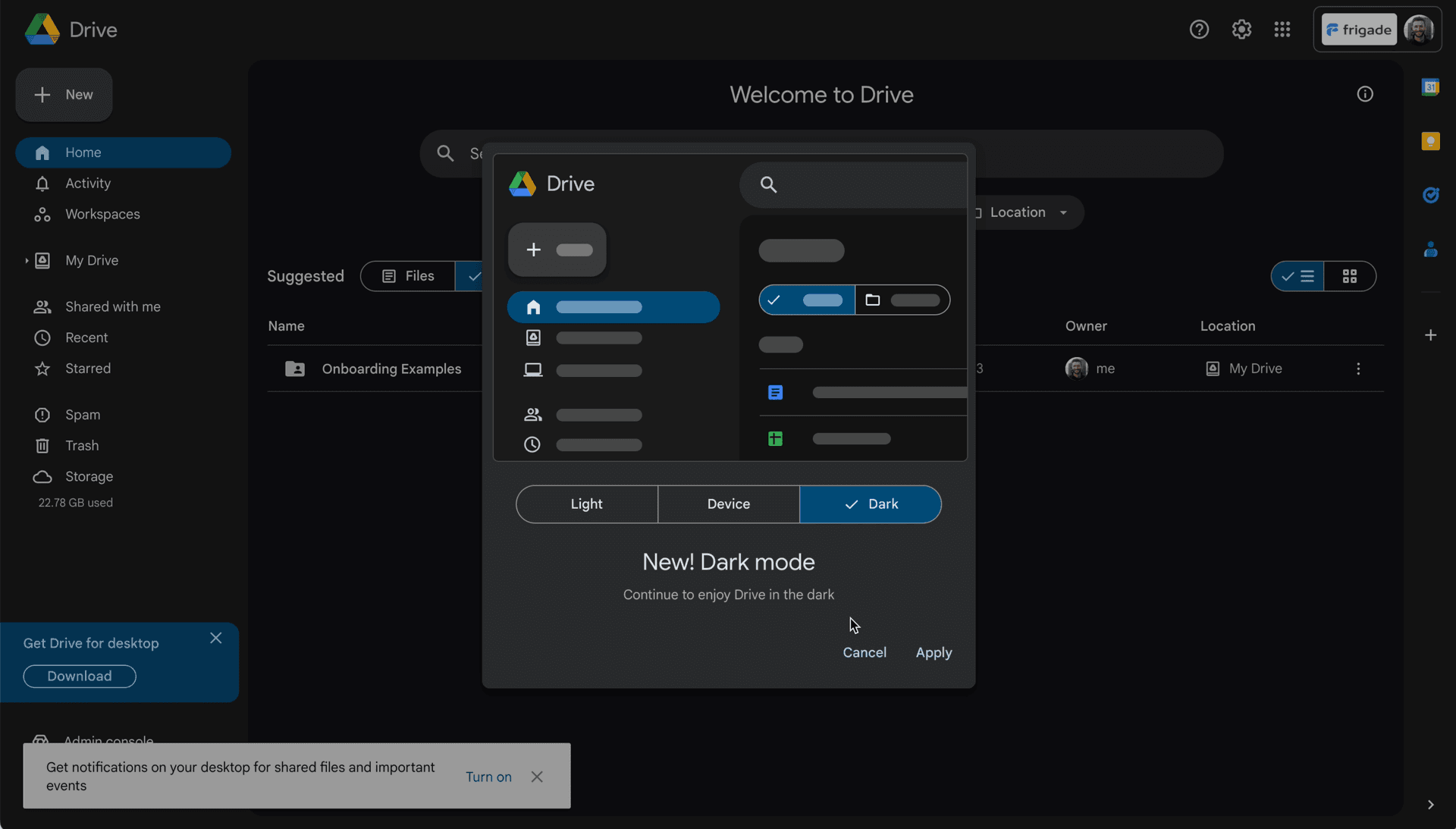
Google Drive announced dark mode with a modal that shows a dark preview of Drive, plus a Light, Device, and Dark toggle. Pick one and hit Apply, and you never have to leave the announcement to go find a setting. The problem is what's behind it. While the modal is open, there's a "Get Drive for desktop" card in the bottom left and a desktop notifications banner along the bottom. That's three promotions on one screen. I'd spread them out across different sessions.
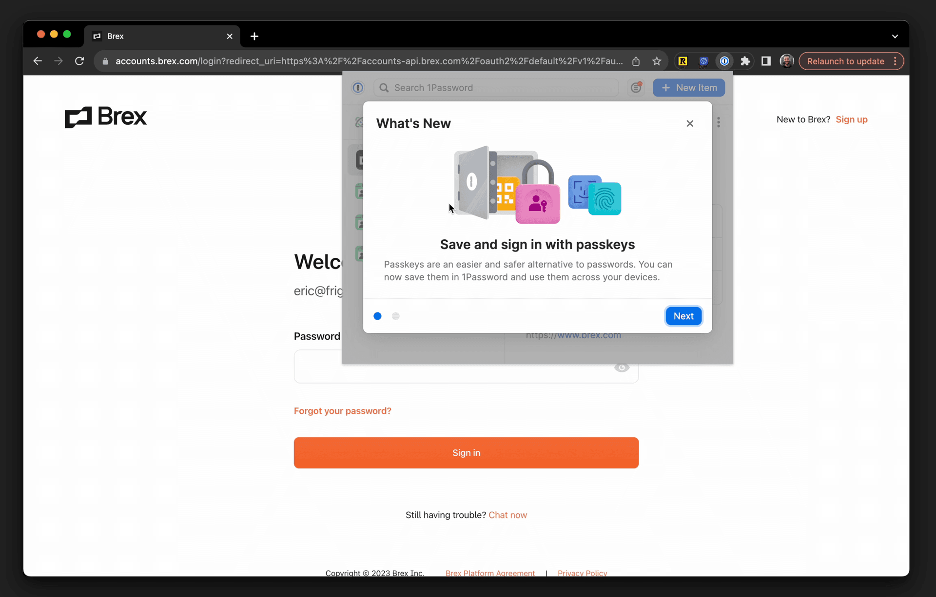
1Password opens a "What's New" modal inside its Chrome extension. It opens by explaining passkeys ("Save and sign in with passkeys"), then slides over to "Try saving your" first passkey with a row of apps that support them, like Google, DocuSign, and GitHub. That turns the explanation into a next step. It's two pages, there's a Next button and a Dismiss button, and that's it.
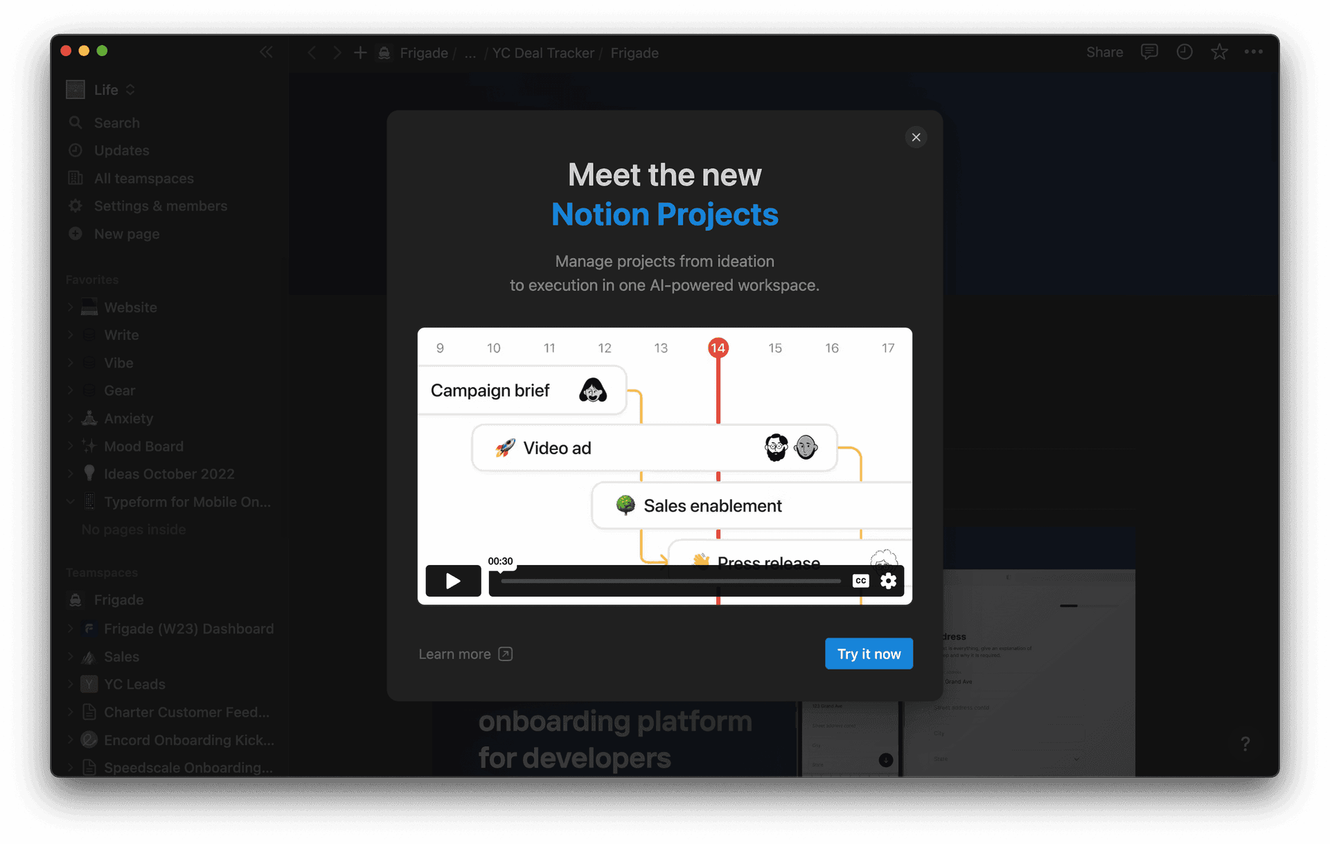
Notion launched Projects with a popup that has a headline ("Meet the new Notion Projects"), one line of copy, and a short video. The primary button says "Try it now" and takes you into a guided demo of the feature. There's a "Learn more" link if you'd rather read. The button goes to the feature itself.
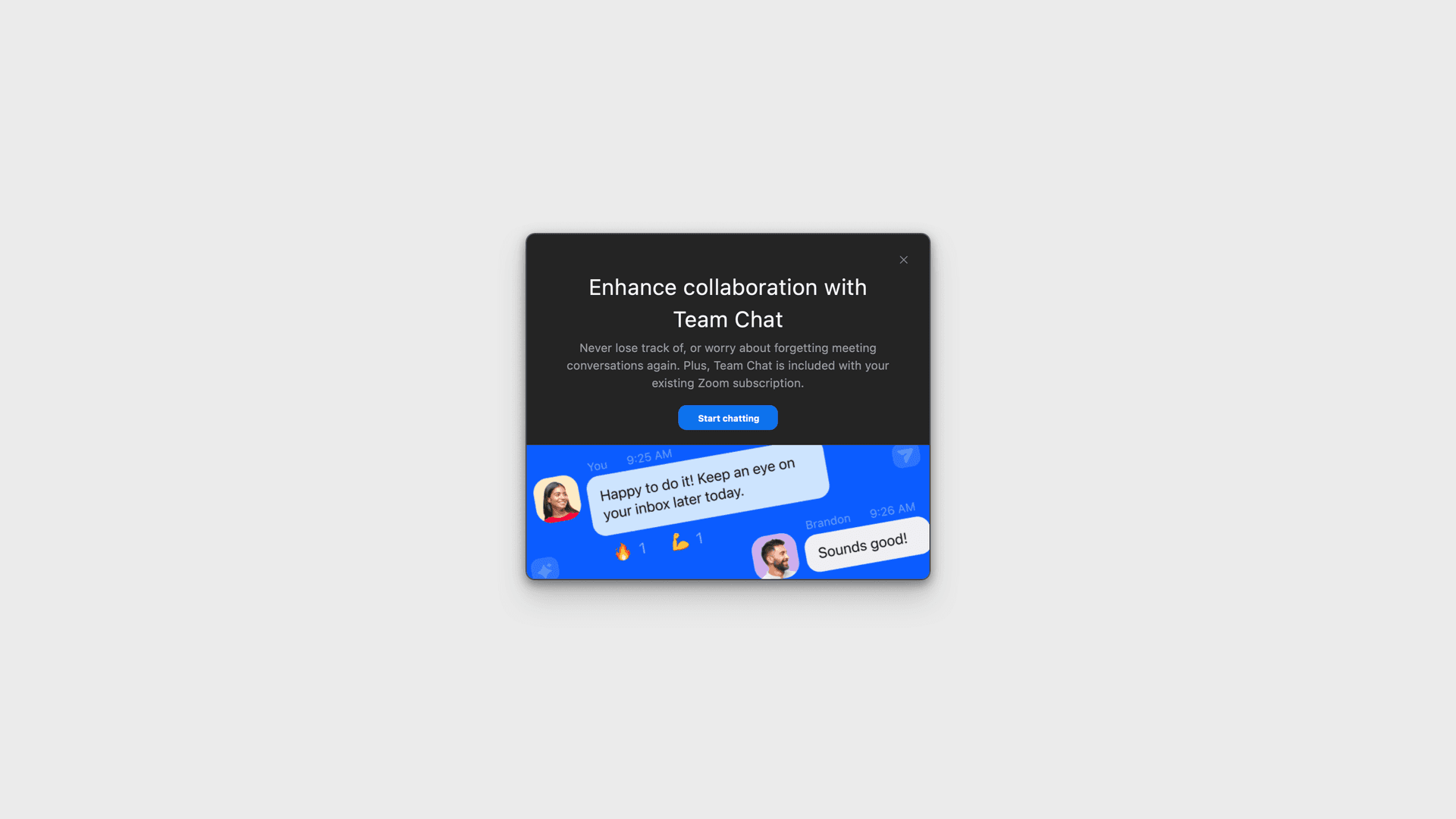
Zoom shows an announcement after a call ends to promote Team Chat. The copy says Team Chat is included with your existing Zoom subscription. That line does a lot of work. People ignore promotions because they assume there's a price tag attached, and Zoom answers that before you ask. And showing it after the call means it doesn't interrupt a meeting.
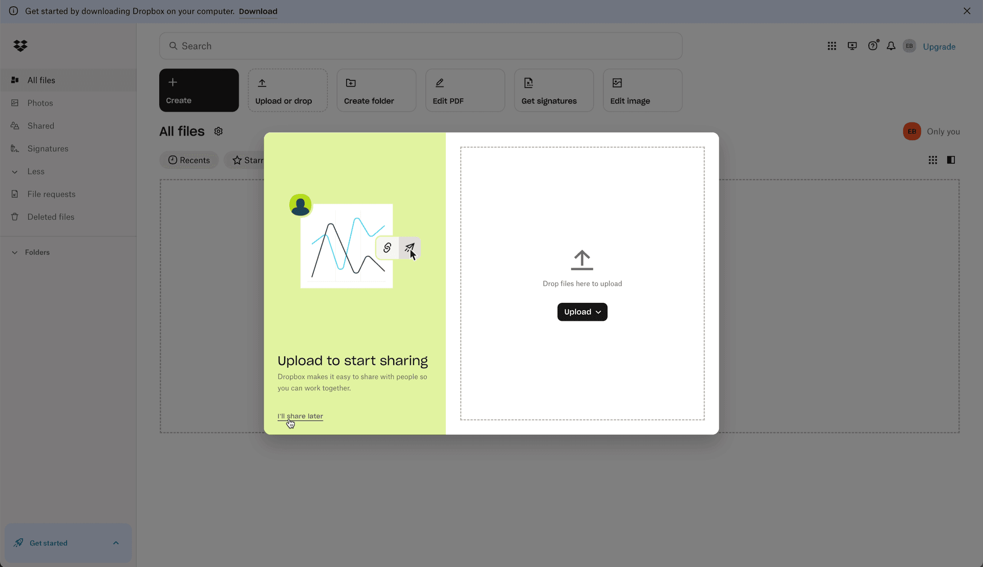
Dropbox isn't announcing a new feature here, but the mechanic is worth copying. After signup you get a welcome announcement that's focused on one thing: upload a file. The upload drop zone is inside the announcement itself. If you're not ready, there's an "I'll share later" link. If you can make the action happen inside the modal, do it.
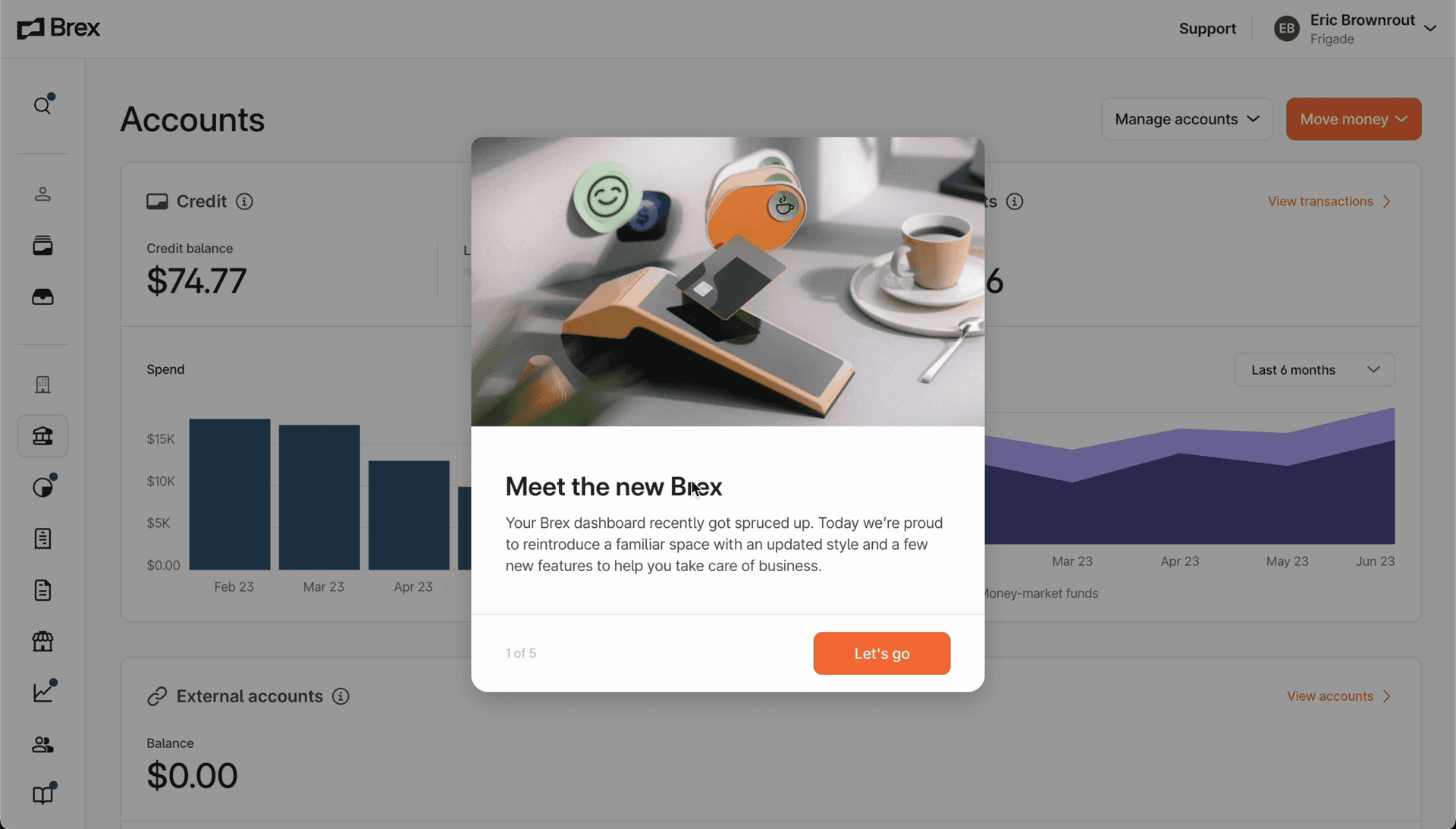
Brex introduced its dashboard redesign with a five step announcement that opens with "Meet the new Brex." It shows up when you sign in for the first time after the change. The clever part is step three. It says "Action required" and asks you to set budget limits for users who don't have one. Brex used the redesign moment to fix missing account info. The guided tour after that is optional, and there's a permanent hub where you can find the tour again later.
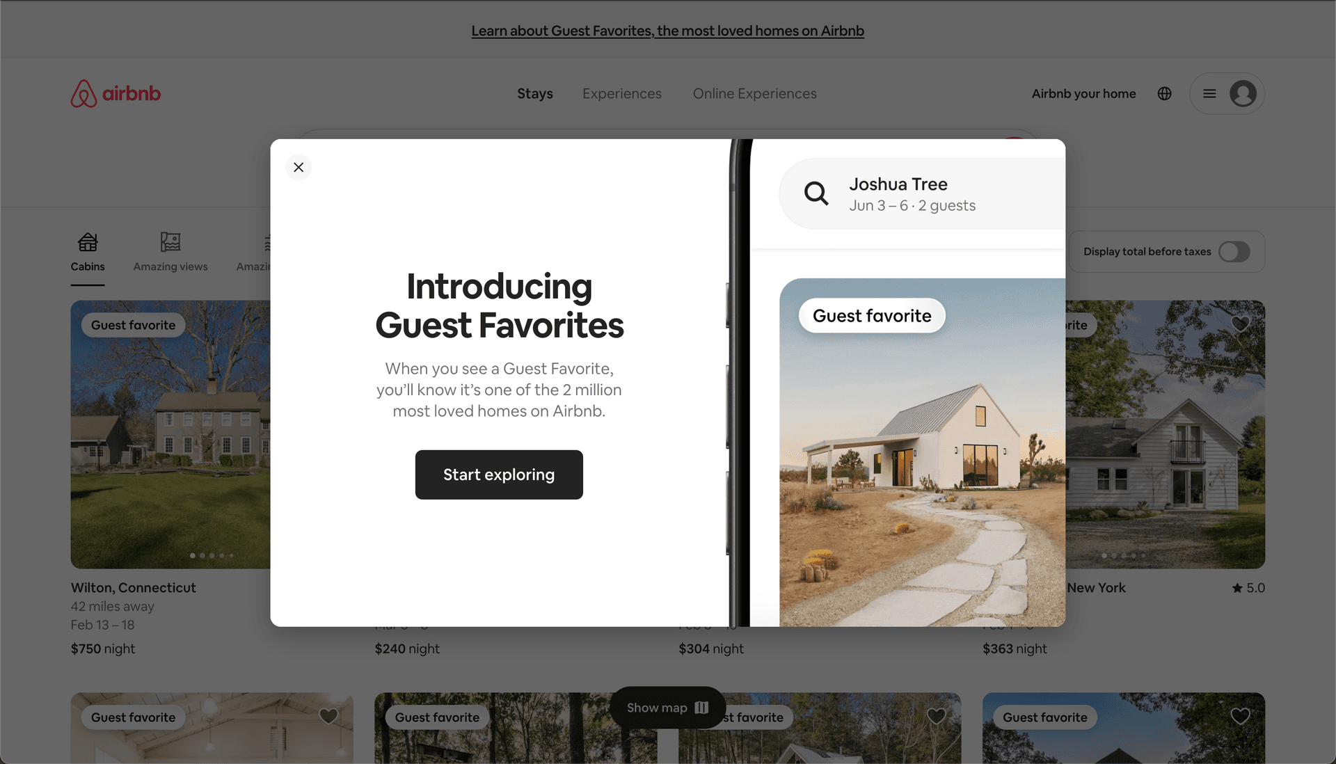
Airbnb introduced Guest Favorites with a two-panel modal. On the left, the headline and one sentence explaining what the badge means. On the right, a phone mockup showing a listing with the badge on it. There's also a link at the very top of the page to learn more. Airbnb uses a smaller version of this for pricing changes, with a modal that just says "You're seeing total prices that include all fees" and a "Got it" button.
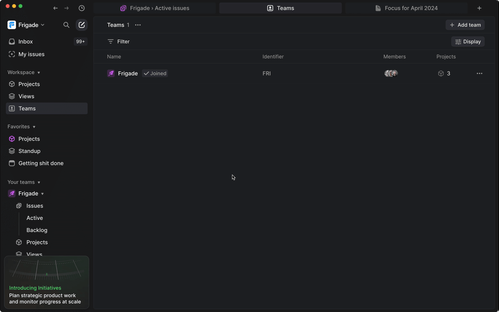
Linear has a reusable spot in the bottom left of the app for promotions. In the screenshot, the card says "Introducing Initiatives." You can dismiss it. If you click it, it opens a modal with more detail, and after that the card doesn't come back. Because every launch goes through the same spot, you never get several promotions fighting for the screen.
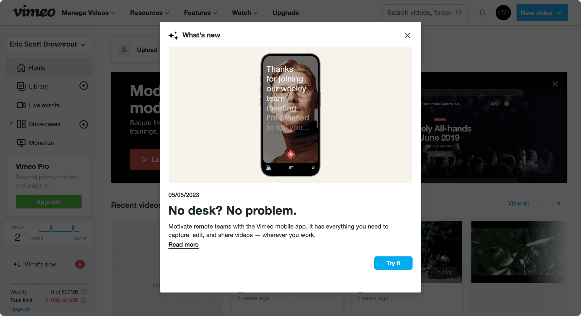
Vimeo puts a "What's new" item in the bottom left of its dashboard with a badge showing how many updates you haven't seen. Click it and you get a scrollable modal of updates, each one dated and with its own button. Nothing pops up on its own, so the badge does all the nudging. I'd use this for products that ship often, where a modal for every release would get old fast.
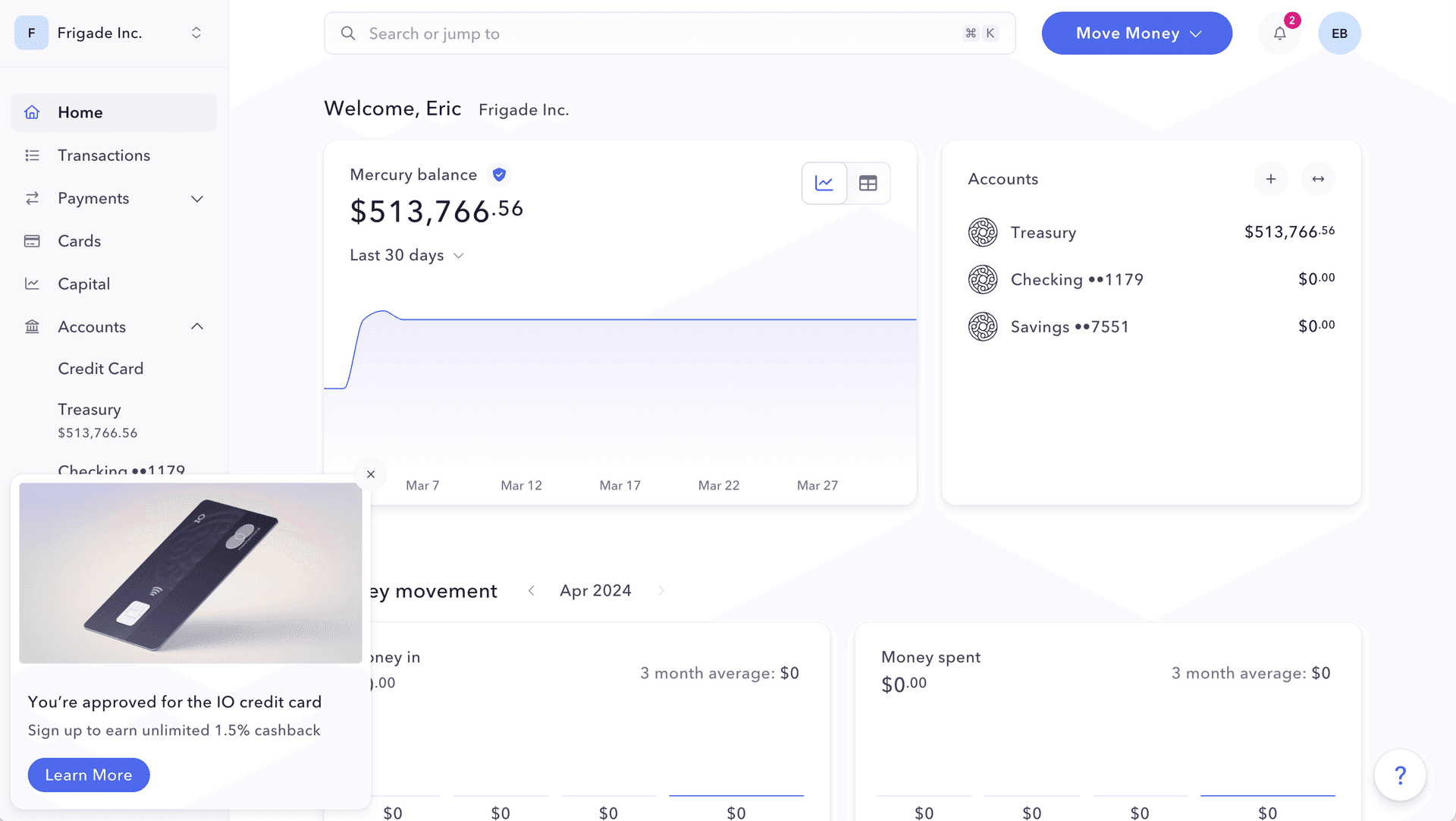
Mercury promotes its credit card with a small card in the bottom left corner, with an image of the card, a short "You're approved" headline, and a Learn More button. There's no overlay. You keep working and it stays in the corner until you close it. That probably means fewer clicks than a modal would get. It also means fewer people annoyed by a promotion they didn't care about. If you go this route, compare clicks against dismisses and check whether session length or in-app actions drop after it appears.
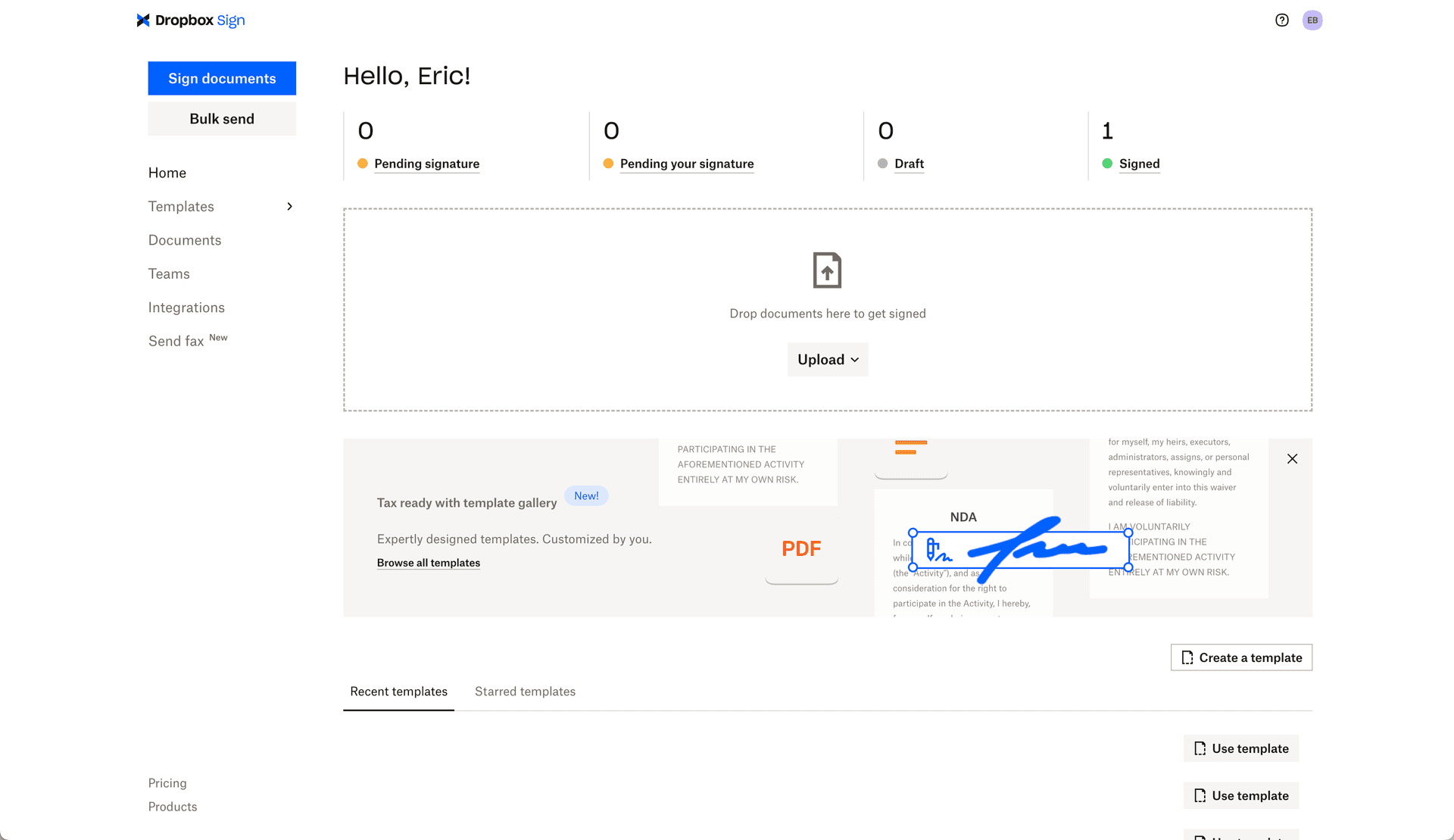
Dropbox Sign announced its template gallery with a banner in the middle of the home page, right under the upload area and above your recent templates. It has a "New!" badge, one line of copy, and a "Browse all templates" link. People who use templates see it where they already look for them.
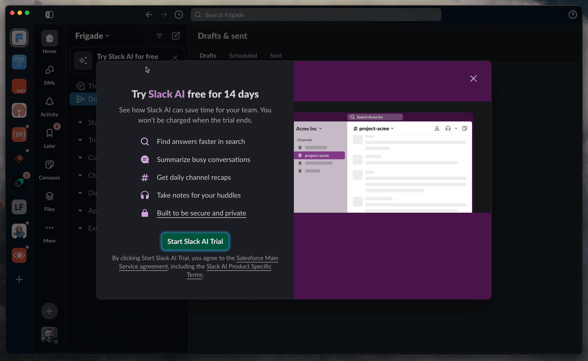
Slack puts a dismissible "Try Slack AI for free" card at the top of the sidebar. Click it and you get a modal with five things Slack AI does, a screenshot, and a "Start Slack AI Trial" button. The line I'd copy is "You won't be charged when the trial ends." That takes away the main reason people skip a trial.
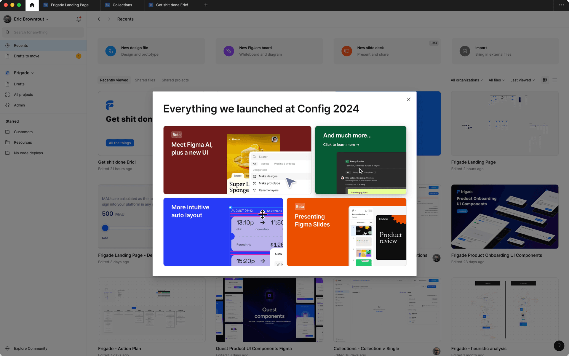
Figma catches you at the start of a session. One announcement is a recap of everything it launched at Config 2024, laid out as tiles (Figma AI with a new UI, auto layout, Figma Slides, and a "much more" tile). Another is a multi-step FigJam AI announcement with a "Try FigJam AI" button and example prompts you could start with. The Config recap works because it's a one-time event. I wouldn't use a grid like that for every release.
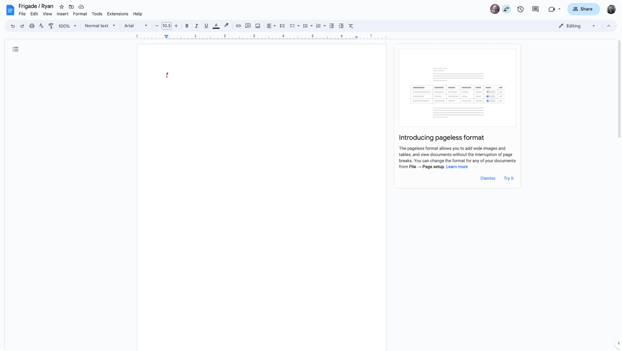
Google Docs and Sheets use small cards next to your work instead of modals. In Docs, a card on the side of the page introduces the pageless format, says where to change it (File, then Page setup), and has "Dismiss" and "Try it" buttons. In Sheets, a card for dropdown chips offers "Got it" or "Show me how." Telling you where the setting lives is a nice touch. You can find it again later without the card.
The good ones put the action inside the announcement. You apply dark mode in Google's modal and upload your first file in Dropbox's. Slack starts the trial from its modal too. They're short. 1Password is two pages and Notion is one screen with a video. They can all be dismissed. And the ones that show up often (Linear, Vimeo, Mercury) live in one fixed spot so they don't stack up. Google Drive shows what happens when they do stack up.
The less obvious part is everything around the announcement. Linear's card knows you already clicked it. Brex shows its redesign modal only to people who haven't seen the new experience. Zoom waits until your call is over. That's per-user state and targeting, and building it yourself for every launch adds up. Our feature adoption software list compares the tools that handle it.
At Frigade, Engage ships announcements, banners, and cards with that state and targeting built in. It's developer-friendly, and there's a no-code editor so a PM or marketer can change the copy or targeting without a deploy. Plenty of people skip the announcement and just ask how to do something later. The Frigade Assistant is an AI assistant that lives inside your product, knows it end to end, and can take actions for your users, so it handles that user too.
If you want more examples, our SaaS user onboarding examples roundup covers checklists, forms, and tours, and the onboarding UX patterns library breaks down each component.
Start with Google Drive's dark mode announcement and 1Password's passkeys announcement, since both let you try the feature from inside the announcement. For launches that happen often, look at Linear's corner card and Vimeo's "What's new" badge. For upsells, Slack's AI trial modal is a good model, and for a redesign, look at Brex.
One headline that names the feature, one or two sentences on what it does for the user, and one button that takes them to it or turns it on. Add an image or a short video if the feature is visual. Notion's Projects announcement is a good template. Make it dismissible and show it once.
Use a modal for big launches and changes people will run into right away, like Brex's redesign or Airbnb's Guest Favorites. For everything else, a card or banner in a consistent spot (Linear, Mercury, Dropbox Sign) interrupts less. If you ship every week, a "What's new" area like Vimeo's keeps things out of the way until people want them.
Measure whether people used the feature afterwards. The click on the announcement doesn't tell you that. Also compare the click rate to the dismiss rate. If you're using a lower-key format like Mercury's corner card, check whether session length or in-app actions change after the announcement goes live.