The best product tour examples I know are Figma's and Slack's redesign tours, Brex's redesign tour with its tour hub, Framer's opt-in welcome tour, Notion's feature launch demo for Notion Projects, and Loom's first-recording tour. PayPal's dashboard tour is the one to study for what not to do. All of them are on this site with screenshots and screen recordings, and every example below links to the full write-up.
A tour that welcomes a brand new user has a different job from one that explains a redesign to people who already know the product. A feature launch tour has a third job. So I've grouped them that way.
Framer opens new users into an example project and shows a welcome modal on top of it. The modal says "Welcome to Framer," has an animated preview of the product at the top, and one button: "Take the Tour." The tour itself is a semi-interactive video. Framer's editor has a lot going on, and a row of tooltips pointing at panels wouldn't explain much. The example project does some teaching too, because its content covers key Framer concepts. If you skip the tour, you're still sitting in a project that shows you how things work.
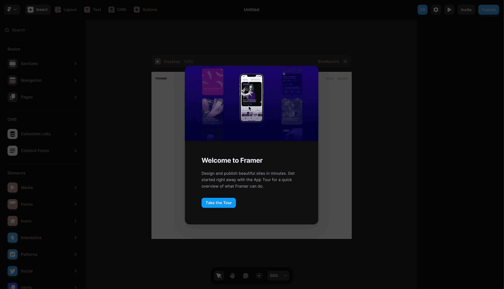
Copy the opt-in, and the animated preview that shows you what you're agreeing to before you click.
Loom runs a short tooltip tour around your first recording. It starts with "Welcome to Loom" next to the recorder and moves on to steps like "Learn the controls," which points at the pause and stop buttons with a hand-drawn squiggly arrow. Each step has a close button and progress dashes, and the tour only shows once. That keeps the risk low.
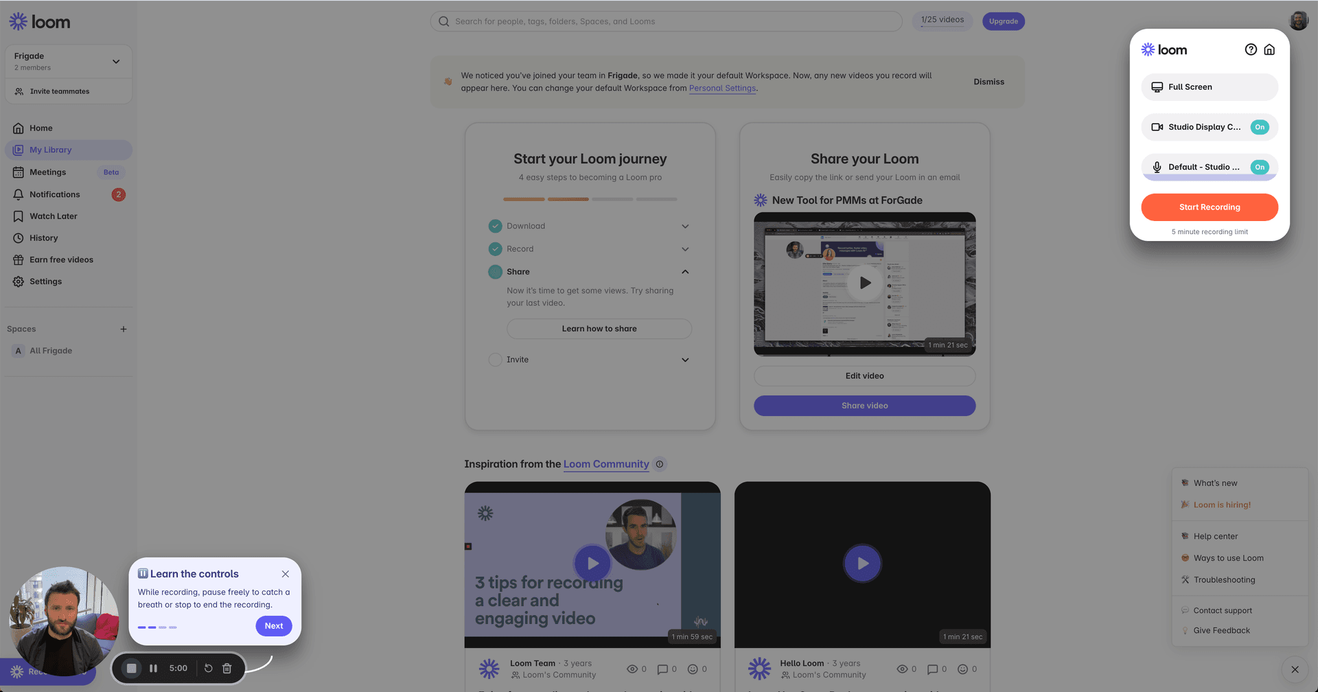
The weak spot is that the steps are all informational. "This is this button, that is that button." Anyone who's used a video recorder already knows what pause does. A tour that asks you to do something, like start a recording, teaches more than one that labels buttons.
Redesign tours are a different problem. Your users already know the product, and you just moved everything. A welcome doesn't help them, they need to know where their stuff went.
Figma announced its UI3 redesign with a modal ("Try the new Figma") and a "Take the tour" button. The tour is five steps. Steps pair a short preview of the change with a line of copy. "Switch into Dev Mode" points at the toolbar toggle and mentions the ⇧D shortcut. You can click the highlighted element to move forward, so you're using the new interface while you learn it.
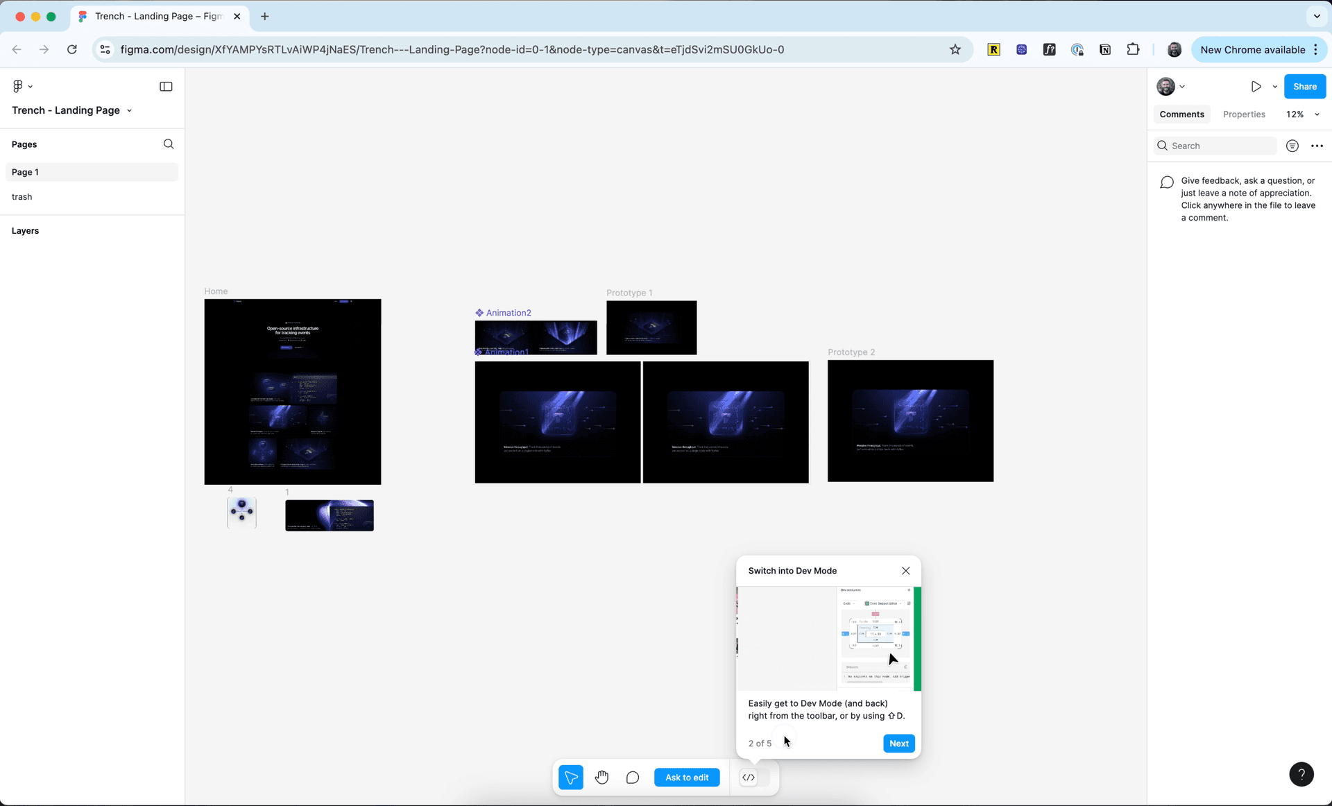
It works because it's short, and you learn the new interface by clicking around in it instead of reading about it.
Slack rolled out its redesign workspace by workspace. The first time you enter a workspace that has the new design, you get an announcement: "A fresh, more focused Slack!" It has two buttons, "I'll Explore on My Own" and "See What's New." Pick the second and you get a five-step tour. Steps have a short explanation, some with an illustration, like "Jump on a voice or video huddle." Part of the tour uses native components, like a theme chooser, so you're setting up the new interface as you go.
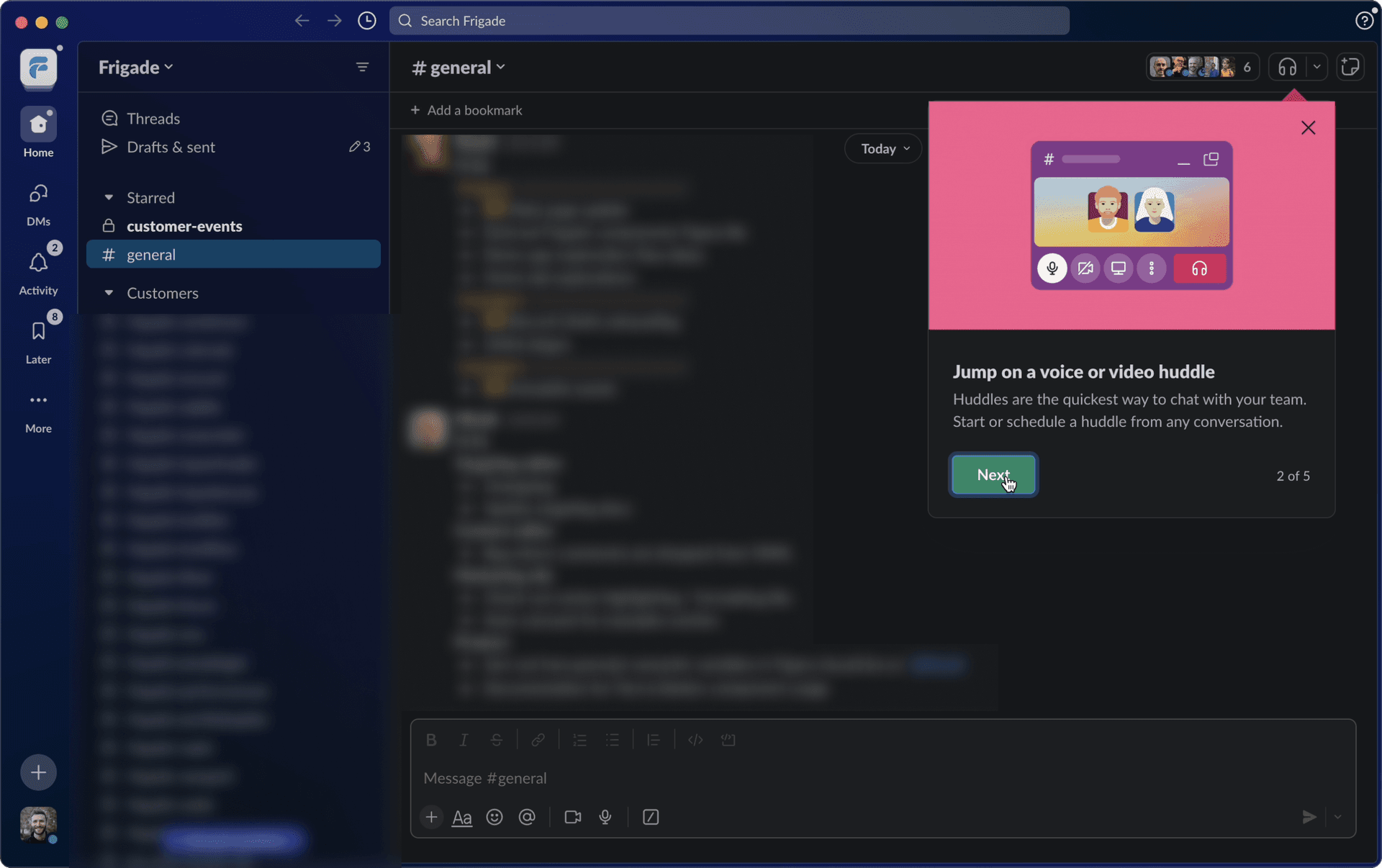
The last step is my favorite part. It tells you to check out the changes later in Help and share feedback, with a link to a summary of what's new. So if you rushed through the tour, you know where to find it again.
Brex shows a multi-step announcement the first time you sign in after its dashboard redesign. It starts with "Meet the new Brex" and a "1 of 5" counter. The announcement also asks for any account information that's missing, so the redesign moment does double duty. The tours are optional. What I like most is the hub. Under Support, there's a "Brex tours" panel called "Get to know your dashboard" with a Launch button next to each tour, like "Dashboard overview" and "Wallet."
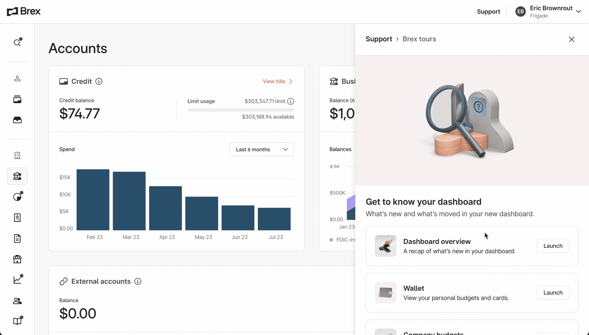
This fixes a problem we see with a lot of tours. People dismiss them because they're busy, then can't get them back when they actually need help. Brex lets them relaunch any tour whenever they want.
Notion launched Notion Projects with a modal that has a short video explainer. The two options are "Learn more" and "Try it now." Clicking "Try it now" drops you into a guided demo on a Notion Projects page. The steps point at real fields on a task, like "Select a project. Click to add this task to a project," with dot progress and a close button on each step.
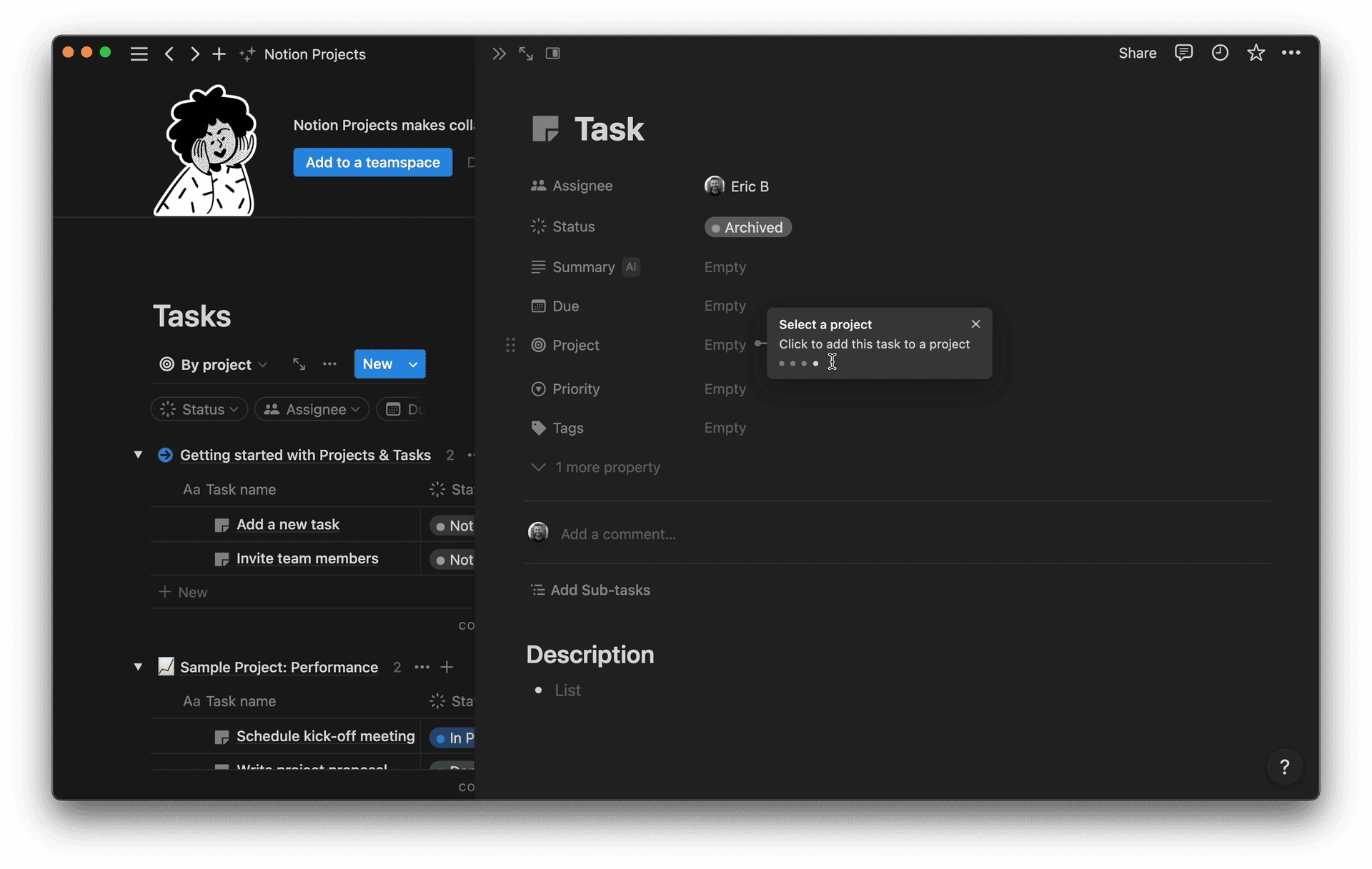
It works because the tour starts from the user's own click on "Try it now." Then it asks you to act on real fields, like picking a project for a task, so you use the feature while you learn it.
PayPal gets some things right. The tour is optional and short, three steps. New users see a targeted announcement inviting them to take it.
The problems are in the details. The announcement is a plain black box that blends into the dashboard. The "OK" button is the one that looks like a button, and "Take a tour" is an underlined text link next to it. So the easy click is the one that skips the tour.
The tour itself is three plain black tooltips with no media. They point at parts of the dashboard that are already clearly labeled. The tour also doesn't take over the screen. In the screenshots, the first step, "Insights," shows up on top of the "Complete your profile" card while the Insights section is further down the page. A later step, "Notifications," shows up at the bottom of the page after a scroll, and it's easy to lose track of where the tour went.
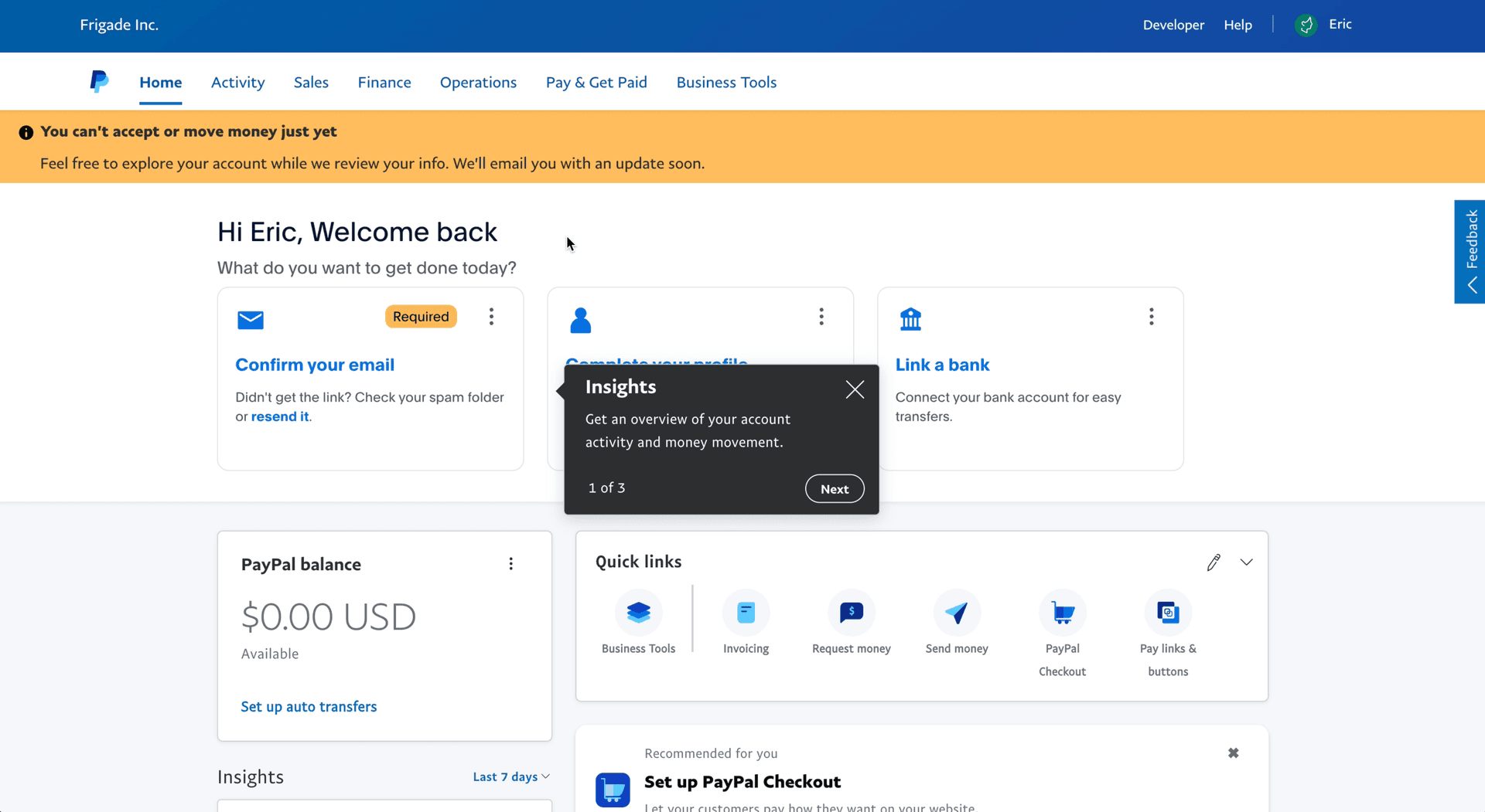
PayPal's tour is about as long as Figma's or Slack's. What it's missing is a reason to read each step, and tooltips that stay next to the thing they describe.
A few practical rules show up across all of them.
Keep it short. Figma and Slack stop at five steps, and so does Brex's redesign announcement. PayPal stops at three, and that's fine. Length wasn't PayPal's problem. If your tour needs more than five steps, it's probably two tours.
Trigger it when the user has a reason to care. Slack fires its announcement the first time you enter a workspace with the new design. Brex fires on your first sign-in after the redesign. Notion's demo starts when you click "Try it now." Nobody gets a tour on a random page load.
Make it skippable, every time. Framer, Figma, Slack, Brex, and PayPal ask before they start. Loom and Notion put a close button on every step. Slack's "I'll Explore on My Own" is a good model for the skip button. It says what the user wants to do, not "No thanks."
Make it easy to get back. Brex's hub and Slack's pointer to Help both solve the same thing. The user who skips today might want the tour on Thursday.
Ask the user to do something. The tours I like best (Figma, Notion, Slack's theme chooser) have you click the real UI. Loom and PayPal mostly label things, and that's where they're weakest.
If you're building one, our guide on how to build product tours covers the implementation, and why product tours get skipped goes deeper on the opt-in question. The tour component page collects every tour example on the site.
The tooltip is the easy part. Knowing who has seen which step, and who should get the tour next, is where the engineering time goes. Frigade Engage ships tours, checklists, and announcements like these. It's developer-friendly, and there's a no-code editor so a PM can change a step without a deploy. For the users who skip the tour anyway, the Frigade Assistant is an AI assistant that lives inside your product and knows it end to end. When a user asks how to do something, it walks them through the actual workflow and can take the action for them. If you're comparing options, see our list of the best product tour software.
Figma's and Slack's redesign tours are the two I point people to first. Both are opt-in, five steps, and only cover what changed. For first-run onboarding, look at Framer's welcome modal and video tour. For a feature launch, look at Notion Projects, where the tour starts from a "Try it now" button. Brex is worth studying for its tour hub, and PayPal is a useful example of what to avoid.
Five or fewer. Figma and Slack use five, Brex's redesign announcement uses five, and PayPal uses three. If you need more than that, split it up and trigger the second part when the user gets to that part of the product.
Yes. Every tour on this list either asks before it starts or lets you close it on any step. A forced tour gets clicked through without anyone reading it. An opt-in tour gets people who actually want the help. Add a way to relaunch it later, like Brex's tour hub, for people who skipped it the first time.
An interactive tour moves forward when the user does something in the real UI, like clicking the highlighted element in Figma's tour or picking a project in Notion's demo. A regular tour just shows tooltips with a Next button. Interactive tours teach more because the user has done the thing by the end. We cover the difference in more detail in product tour vs walkthrough.
When the user has a reason to care. That's usually the first session, the first visit after a redesign, or the moment they click into a new feature. And make starting it the main button. PayPal's "OK" button looks like the main action, so a lot of people will probably skip the tour without thinking about it.