A pattern we keep watching: a team adds a forced tour, activation jumps, and a month later day-7 retention is worse than it was before. The dashboard reads "we improved onboarding." The cohort behaves like they are mad at the product.
There are two ways to increase product adoption. One works in the short term and quietly destroys retention. The other works slowly and compounds.
The short-term version is the familiar one: forced tours, blocking modals, daily emails, "you have not done X yet" reminders, drip campaigns from your CRM. The metrics move for two weeks, then they plateau. By then you have trained the user to dismiss your product as a category. The fancy term for it is banner blindness. The simple term is annoyance.
The long-term version is harder to write a JIRA ticket for: reduce friction at the points where adoption naturally happens, surface the right tip at the right time, and get out of the way.
We have shipped both versions ourselves. The forced version moves the metric you were asked to move. The respectful version moves the metric you actually wanted. Here are the six places to make the trade.
The forced tour blocks the new user behind a five-step modal sequence before they can use the product. It will increase your tour-completion rate because users have no choice. It will not increase activation, and it measurably depresses day-7 retention.
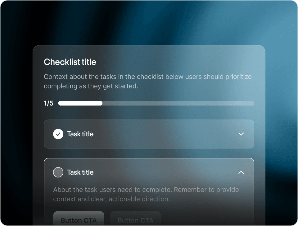
The respectful version is an embedded checklist the user can dismiss any time. Cal.com and Loom both ship this pattern. The first instinct is to actually engage with the checklist because there is no penalty for ignoring it. We wrote about why static tours fail this test in Why Most Product Tours Get Skipped.
The email drip is "you signed up three days ago and have not done X yet." It is sent regardless of what the user has actually done. Open rates are bad. Click-through is worse. Unsubscribes climb.
The respectful version is a contextual prompt inside the product, fired after the user does a related action. They created a project. The next prompt asks them to invite a teammate to that project. The prompt is anchored to a real moment of relevance. Email is not useless, but it is the wrong channel for "have you tried this feature."
Some apps ship a permanent "tip of the day" widget, or a checklist that never marks itself complete because the criteria are vague. The user starts treating it as visual noise.
The respectful version is progress that has a clear end. The checklist marks complete when the user does the things, then it disappears. Permanently. Completing the work has a real reward (less stuff on the screen), and users are more likely to complete it. Mercury's adoption pattern ships exactly this shape.
A modal that announces a new feature to every user, regardless of whether the feature is relevant to them, gets dismissed by the 80 percent for whom it is irrelevant. The 20 percent who would have cared dismiss it too, because they have been trained to read it as a banner ad.
The respectful version announces features only to users for whom the feature is relevant. The cost is real (you need segmentation), but small. The benefit is that announcements feel like the product paying attention to the user, rather than the marketing team paying attention to its launch calendar.
The wall: the user clicks something, gets a modal that says "Upgrade to access this feature," with no other path forward. They close the modal, do not upgrade, and now associate the feature with frustration.
The respectful version shows what the feature would do if they had it, then offers the upgrade. The user understands the value, can opt in, and can keep using the product if they pass. They do not associate the feature with a wall. Slack's AI feature upsell is a clean example: the card promotes, shows enough of the feature to be interesting, and offers the upgrade as the next step but not the only one.
These two messages contain the same information:
- "You have not connected your calendar yet. Connect it now to get more from [Product]."
- "Want notifications on the go? Connect your calendar in two clicks."
The first is guilt. The second is an offer. The first works once. The second works repeatedly.
The guilt version is more common because it is easier to write. The offer version requires actual thought about why the user might want the thing, and a willingness to be turned down without retaliation.
The pushback we hear most often is "but the forced tour did move our activation number." It does. The honest answer is that activation is the wrong number to chase in isolation. Day-7 retention conditional on activation is the number that matters, and it almost always tells the opposite story.
The other counter is "we do not have time to do the respectful version on every surface." Probably true. The trade is to pick the two or three surfaces that produce the most user resentment (forced tour, blocking upsell, permanent badge are the usual suspects) and convert those. The rest can wait.
Teams that move from the annoying patterns to the respectful ones see the same shape of change. Activation goes down slightly in the first month, because forced tours had been inflating the "saw the event" number. Day-7 and day-30 retention go up, because the cohort that comes back actually wants to be there. Support volume on "how do I" questions drops, because contextual prompts catch the issues that previously generated tickets. NPS comments shift in tone, from "this product feels pushy" toward "this product is easy to use."
The trade is real. You give up some short-term metric inflation. You buy back some long-term cohort health.
The respectful pattern compounds because users have memory. A user who has dismissed five blocking modals in the last week is developing a relationship with your product, and that relationship is adversarial. A user who has been helped at the right moments five times in the last week is also developing a relationship, and that one is collaborative.
Six months in, the adversarial cohort is gone. The collaborative cohort is still there, has tried more features, and is more likely to be in a paid tier. The slope of the curve is the entire game.
The thread running through every "better" pattern above is the same: the intervention has to be relevant to that user, at that moment. The forced tour fires for everyone. The guilt prompt ignores what the user came to do. The blanket announcement buries the user it would have helped.
The architectural version of this is the pattern that only appears when the specific user actually needs help, and the rest of the time is silent. That is hard to ship with the traditional onboarding toolkit, because the toolkit is built around scheduled, authored experiences. The tour fires on day 0. The upsell card fires on day 7. Whether the user needs them is not part of the design.
It is the design principle behind the Frigade Assistant, the AI agent we built. It learns your product the way a real user would, then helps users on demand when they ask, and proactively via Frigade Suggestions when the moment is right. When a user is fine, the agent stays out of the way. There is no fixed schedule. The intervention happens when it is genuinely useful, or not at all.
This is the long way to do adoption. It is also the only way that compounds.